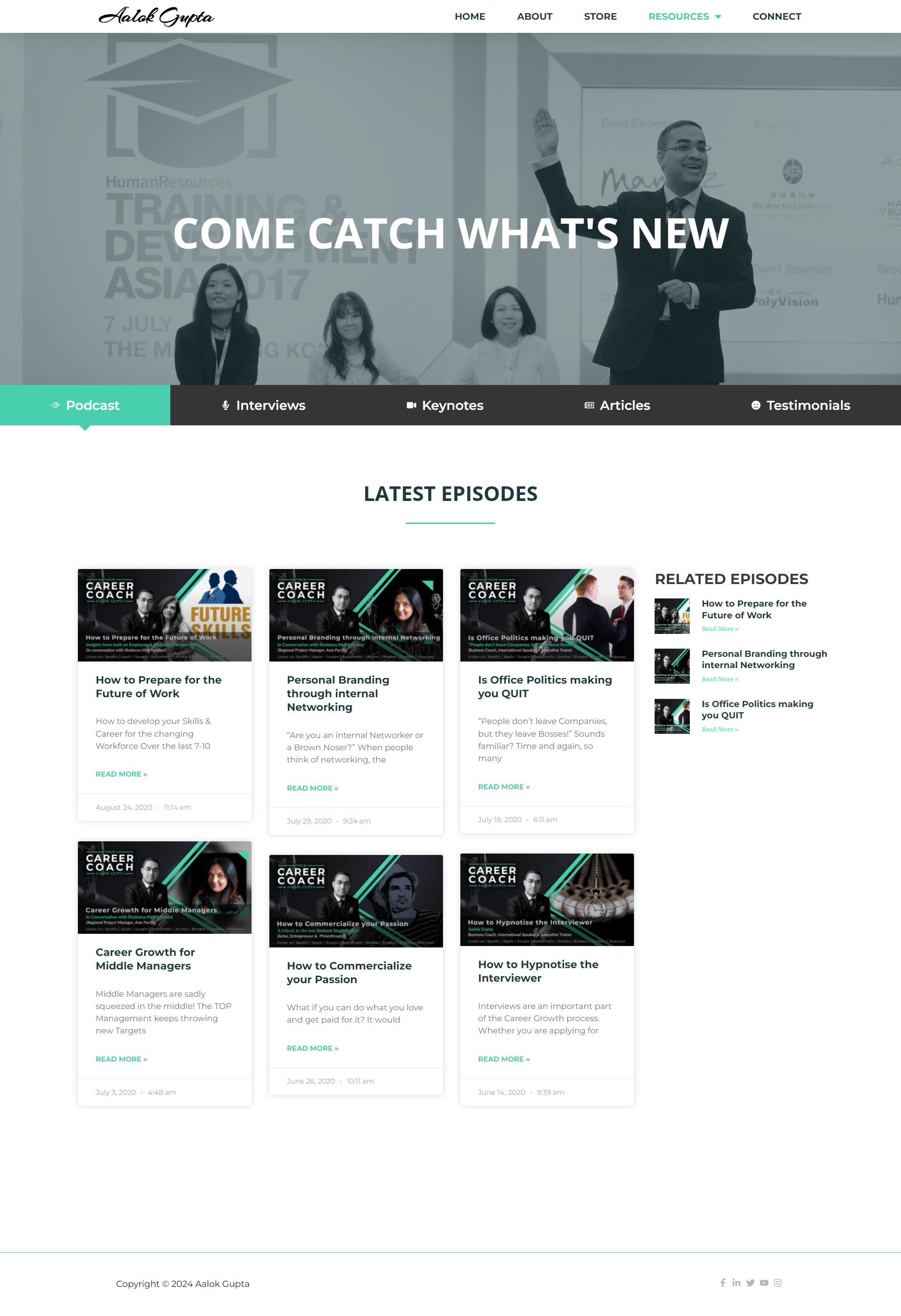
Website Design
Need to make a unique design for a consulting coach
I began by creating color swatches that represent the brand’s name and values. Then, we added line art illustrations that complement the brand name and logo.
The client was thrilled with the final result, which was achieved through our diligent process from research to sketching and illustrating.
Crafting Brand Identity: From Color Swatches to Illustrative Excellence
We began by creating color swatches that represent the brand’s name and values. Then, we added line art illustrations that complement the brand name and logo.
The client was thrilled with the final result, which was achieved through our diligent process from research to sketching and illustrating.
Revamping the Website for Better Impact and Brand Identity
The previous website was a single-page site with a dark black theme, which made it difficult for the website to stand out. Therefore, we needed to start from scratch, developing a brand guideline for both the website and the overall brand.
There was insufficient content to make the site impactful and distinguish it from the competition.
We’re created what will strike people in first glance
We replaced the dark black theme with greyscale images, incorporating green as the primary highlight color across 60% of the design.
Green was chosen for the branding because it symbolizes growth, balance, and renewal—qualities perfectly aligned with personal and professional development.


